top of page
Increasing engagement and improving usability of the customer account
Web | iOS | Android
Role:
Design Lead
Timeline:
10 months
Research, UX/UI,
Information Architecture


PROJECT SUMMARY
Embrace Pet Insurance provides peace of mind for pet parents. Policyholders utilize the customer account to access all information regarding their policies and, most importantly, to submit claims. Originally built on deprecated technology, the customer account needed to be developed on a new tech stack, which allowed us the perfect timing to do a complete redesign. More than a UI overhaul, the customer account redesign improved functionality across the board, making impactful enhancements for users.
STRATEGY & SCOPE
While the launching point was moving the application to a new tech stack, the goal of this project was to enhance efficiency, self service, and customer satisfaction. Due to business priorities and resources, the mobile app was the first platform to undergo a full redesign. The web app followed shortly after, utilizing findings and decisions made during the mobile app process, creating a cohesive customer experience and minimizing the timeline for the the design phase.
STEP ONE
Audit the original designs
Existing web
Application is no longer available.
Existing mobile app
Application is no longer available.
STEP TWO
Gather qualitative and quantitative insights
USER RESEARCH ANALYSIS
First, I analyzed existing user research the organization had completed shortly before my employment. I studied user surveys, interviews, and usability tests to determine the key areas of opportunity for the redesign.
GOALS
-
Submit a claim
-
Add a pet
-
View policy info
-
Change coverage
-
Upload documents
-
View current and past claims
CONSTRAINTS
-
Lack of understanding info/documents needed to submit a claim
-
Misunderstanding of policy coverage
FRUSTRATIONS
-
Very little communication on claim status
-
App quitting in the middle of use
-
Unable to view uploaded invoice once claim is submitted
-
Difficulty locating and understanding pre-existing conditions
COMPETITIVE ANALYSIS
Next, I conducted a competitive analysis of several other pet insurance brands' customer accounts. This allowed me to gain insights into how competitors were addressing pain points and improving customer retention.

INFORMATION ARCHITECTURE STUDY
Finally, I ran an open card sort test to analyze the current information architecture of our customer account and used my findings to restructure the new apps.
STEP THREE
Brainstorm and ideate


PROPOSED NEW SITEMAP
Based on the results of the research, I crafted a new navigation and information architecture for both the web portal and mobile app.
WIREFRAMES


This is not an extensive view of all wireframes.
STEP FOUR
Define a visual system that feels modern, clear, and supportive
...while maintaining the brand vision of the company's other touchpoints


I built out the components of the app in the new UI styling that I was proposing. Each component was created with developer implementation in mind, as well as responsiveness across devices. I utilized variants to allow for efficient use in future designs and updates. This is not an extensive view of the entire library.
Application is no longer available.
I also created a color palette style guide to increase our range of usable colors and improve the implementation process for our brand, white labels, and partners.
STEP FIVE
Build out the final designs
I executed a full redesign of the customer account. Every user flow was carefully reconstructed and variations for all active, error, and empty states were created, resulting in dozens of screens to coordinate with the development team.
SOLUTION ONE
Streamline navigation with user & business needs in mind
Users were getting lost in the original experience, leading to frustration and confusion. I prioritized navigation based on user needs and frequency, resulting in more focused, approachable apps that are intuitive rather than overwhelming.

Previous web navigation

New web navigation


New mobile app navigation
Previous mobile app navigation
SOLUTION TWO
Redesign the homepage to prioritize what matters most
The existing homepage for both applications lacked hierarchy and clear direction. I reworked a cluttered system into inviting, easy to use dashboards for pet parents. I accounted for complex use cases including multiple pets on a policy, empty states for claims, and pets without our wellness product.

Previous web design

New web design

Previous mobile app design

New mobile app design
SOLUTION THREE
Restructure claim details to communicate the process more clearly
Users consistently tell us they want more detailed info regarding their current claims. While we were already providing general claim status, we were not giving our pet parents additional clarification. To improve this feature, I created a tracking section on the claim details page where the user can see the claim status, date it moved to that step, and an explanation.

Previous web design

New web design

Previous mobile app design

New mobile app design
SOLUTION FOUR
Revamp pet details to deliver information more efficiently
Insurance can be confusing. I improved the design here to better visually explain policy coverage and pet details for users. Our research consistently revealed that pet parents need clearer explanations and more transparency to best understand their policy info.

Previous web design

New web design

Previous mobile app design

New mobile app design
SOLUTION FIVE
Modernize billing to allow users to quickly find and edit important details
The billing and reimbursement pages, especially within the mobile app, were confusing and disjointed. I created clear sections for billing information, billing history, and claims reimbursement to allow users to quickly find and edit the information they need.

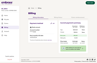
New web design
Previous web design


Previous mobile app design

New mobile app design
SOLUTION SIX
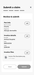
Simplify submit a claim process to improve the user journey
The submit a claim flow previously suffered from a lot of bugs, which was the main focus of improvement here. I also streamlined the process and updated the functionality to be more intuitive.

Previous web design

New web design

Previous mobile app design

New mobile app design
Next steps
Once the data team builds out the necessary parameters, we will be installing proper tracking for the full lifecycle of these changes using Google Analytics, Google Tag Manger, Power BI, Hotjar, etc. As data begins to be tracked, I will be continuously monitoring how these updates perform and making adjustments and improvements.
Key metrics we are interested in:
Retention rate
Pets added to policy
Midterm cancellations
Changes to premium
Time to submit a claim
Keep reading...
Next example of design that drives results
bottom of page