PRINCIPLES OF INTERACTION
SUMMER 21
Interactive Form Design
Designing and developing a usable interactive form utilizing interaction principles and patterns as well as critical, user-centered thinking
This was a three week project where I worked individually to solve a practical scenario using interaction design concepts in order to practice how, when, and where to employ these patterns and principles.
The Problem
As the designer for a (fictional) municipal government, I was tasked with creating a form that would allow town residents to apply for a meals on wheels service. Specific information needed to be captured through the form while also being intuitive and usable for the user.
Initial Explorations + Research
I began sketching by hand to make quick and gestural design iterations. I then moved to digital to make low fidelity wireframes of the entire form process while allowing for all the required information. I annotated my design and worked in a group of four to give and receive feedback.
Initial Wireframes


Design Intent
Either the “Meals for Myself” or “Meals for Another” screens will appear once the user selects one – annotations are the same for both.
The input fields will utilize hints to help guide the user.
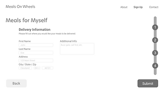
The form is designed so that the user only sees one screen at a time and this helps to keep the user focused on the fields on the current screen and not get overwhelmed by seeing all the fields at once.
Each screen is titled to clearly indicate what the current fields will reflect. There is also a progress bar on the right side of each of the form’s screens to show the user where they are at in the process.
If an invalid response is entered into any field, an error message will display above the field and will allow the user to adjust their entry.
The form will also autosave each entry so that if they need to return to a previous page they do not lose their work.
These wireframes represent each screen that the user would interact with for the Meals on Wheels website. They illustrate the process of signing up through a form to send or receive the Meals on Wheels services.
Overall Design Elements
Feedback + Revisions
I received valuable feedback from my peers that helped me to revise the design. I reworked some of the ordering of the form process and also adjusted details like buttons, checkboxes, and the status indicator. By working through an iterative process, I was able to produce a more successful design that allows the user to not only understand it but easily and intuitively use it.
Revised Wireframes
The user has the ability to click here to send another meal and start the form process again
A confirmation statement is shown here to let the user know they have successfully
completed the form. This feedback lets the user know they are done with the process.
Radio buttons to select either phone or email for notifications – only one option is allowed to be selected here. The option not selected will gray out. The user can toggle between the two if they decide to change their selection.


Radio buttons are used for yes/no question to simplify and prevent errors
If the user selects no above, this section will not appear. If the user selects yes, they are prompted to upload documentation by clicking the button to upload or they can simply drag and drop the file. Once they select a file, it will generate a preview.
Radio buttons to select the meal option – only one option is allowed to be selected here
Address, city and zip code fields are text inputs while the state is a drop down field


Users see this screen when they select “sign up” either on the home page of the website or in the top right menu and is the start of the “form”. They can either select to receive meals for themself or send meals to someone else.
Main header shows the user consistently whether they are on a “meals for myself” or “meals for another” page
Title indicating to the user what the following fields will be about with a brief description underneath
First and last name are separated to prevent errors
Phone field allows 3 digits for the first 2 boxes and 4 digits in the last box
Age is a drop down field and allows the user to select their age
Progress tracker consistently shows the user where they are at in the form process and
how much they have left to go
Continue button allows the user to advance to the following page in the process. This
button is highlighted to help draw attention and guide the user through the journey to
the next step.
This section will only appear if the user selects “lunch and dinner” or “dinner only”. Check buttons to select delivery options – multiple options are allowed here
Space for additional info like drop-off instructions
